Concert Coolness

Final Project for DTC 356 : Information Structures

Introduction

This capstone project was produced by Isabella Guetter, Sydnie Kobza and Kai’Lia Sparks. As avid concert-goers, we thought it would be fun to center our project around the various concerts that we’ve been to over the years. Given that we all have a lot of information about each of our concerts, from the main performer to the location to the date of the show, there were many ways to organize our project. We decided to pick a few of the most natural areas of distinction between the bands and create infographics to demonstrate them. In the following sections, we will discuss the organization of the website, as well as the creation of the genre infographic, concert map, memorabilia infographic, date infographic and Spotify playlist.

Click here to view the Spotify playlist

So What?

Music connects people from all around the world. Being able to use the concert metadata to organize these events can be inspirational to others who want to organize their favorite concerts and merchandise as well. Those who enjoy music can be inspired to get creative with their own metadata and organizational skills. Our project put our knowledge of information structures to the test, and we chose to push the boundaries and showcase how expansive digital information structures can be.

Infographic

Click to view full size


At the outset of this project, the three of us created a spreadsheet to organize all of the information about our concerts. In this spreadsheet, we included band name, date of concert, venue, location of concert (city and state), genre of band, any memorabilia we may have obtained from the show, and a recommended song by each band with a Spotify link. One of the simplest ways to organize all of our information is by the genre of the various bands that we’ve all seen. Thus, Syd created an infographic to display all of the genres of the bands we’ve seen.

She was inspired by an infographic she saw online, which displayed the genres of different movies in the same fashion, from horror to fantasy to noir. In this infographic, Syd took all of the genres listed in the spreadsheet and created 12 unique icons to represent each one. She followed the genre order displayed at the top of the infographic (“pop” being the first and “rap” being the last) and tried to group bands with the same genres together whenever possible. This seems like a contextual way of organization, which is organization tied to a specific set of circumstances, and the circumstance here is genre.

Concert Map

Click to view full size


When examining our dataset, one of the things that stood out the most was the variety of concert venues that we had all been to. With this in mind, we wanted to create an infographic that organized the concerts we have seen by location. Many successful businesses organize their locations in the form of a map so that users can easily find the location closest to them. This also provides a convenient outlet to sort location-based data such as the features specific to each location. For example, instead of listing the locations of a specific coffee company across the US, the company might include a map so the users can see just how far they are from each coffee shop. They might even show an image of the storefront to make it easier to identify. This is exactly the organizational concept that we wanted to play off of when producing this structure.

Since locations are physical beings, organizing them digitally can be more limiting due to the metadata being more restricted. Simply creating a list of locations would limit that physical factor even more. A map, on the other hand, helps represent the physical data by contrasting the locations in relativity to other neighboring locations. For example, telling a user that one concert took place in Colorado and another took place in Seattle doesn’t really give the scope of the distance. Showing them a map, on the other hand, helps them to visualize just how far apart these locations are in reality. It’s the closest representation of the physical location itself.

To organize the concert venues we have been to, Kai coded a MapBox page using JavaScript, jQuery, and HTML5. When the user clicks the thumbnail of the map on the webpage, they are redirected to a fullscreen version. From there they can click on any of the icons to view an image from one of the concerts, a list of concerts we have seen there, and the address. When the icons are clicked, an animation is triggered that zooms the map in to get a closer view of the venue and the surrounding area.

Charts

Click to view full size


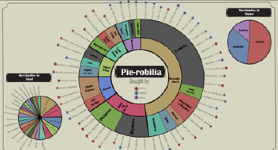
In the back of a concert venue, one can find a corner table filled with merchandise from the band. Merchandise are an essential link between bands, concerts, and their fans. Fans “love owning a physical piece of the band. It’s a statement of their support, and of their belonging to a fanbase that they are proud to be a part of”, according to the article “Music & Merch: A Guide to Selling Merchandise for Bands” (“Music & Merch”). Syd, Izzy, and Kai listed all of their merchandise from the years in their spreadsheet and it was Izzy’s job to organize it.

Physically organizing the merchandise, which employs the first order of order, could only occur in one way. Digitally, in an infographic, there are many ways we can organize the merchandise. Izzy chose to sort the merchandise three different ways. The main piechart broke down the merchandise into broad categories, then broke down further into specific categories, and finally listed the merchandise itself. With 58 pieces of merchandise, deciding the broad categories was interesting. Defining broad categories lead to the creation of categories such as Wearable Merch, Signed Items, and Miscellany. This natural way of organization allowed the merchandise to easily be sorted into the appropriate categories.

After breaking down the merchandise from broad categories to specifics, Izzy chose to include the specific band related to the merchandise, as well as the person who bought it. This extra metadata about the merchandise allowed for more forms of organization. Smaller pie charts were created to showcase the percentage of merch by owner and the percentage of merch related to bands. This second order method of organization allowed for multiple ways to sort the information, and being able to do it digitally made it easier given the abundance of metadata that we were able to provide. If Izzy chose to include more information like dates and location in the main infographic, more small charts could have been made. Metadata is the key to organizing information. This infographic, lovingly named the “Pie-robilia”, is a prime example of how digitally organizing information can be formed in many different ways to suit the individual user.

Click to view full size

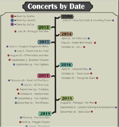
Time is a line that is constantly moving forward. Organizing time, even though it is not a physical matter, can only occur in a straight line that is always moving forward. We remember concerts as far back as 2006, so it was a fun idea to organize the concerts by date, which led Izzy to create the concert dates infographic.

Taking the concert dates and sorting them occurs in the first order of order, and even when done digitally it is the only way time can be organized. Izzy organized the dates from the very first concert Kai saw in June 2006, all the way to the most recent concert seen by Izzy in October of 2019. Adding a little bit of extra metadata, like adding which girl went to which concert, opens the door to organizing the concerts by girl and date, but the timeline would still be moving in a straight line. Some small branches leap out to signify the specific dates, but then the line of time keeps moving forward. This form of organization is arbitrary and natural. We organize time in a straight line our whole lives, and it is often easiest and most natural to organize events by their dates.

Conclusion

This was an enjoyable project for all of us to work on. We immediately realized that there is so much metadata associated with our concert histories and as we learned in class: all metadata has the ability to be connected through tags or other third order of order techniques. This means that music is an excellent method for connection and can encourage social knowing. Social media platforms allow people to connect and form groups more than ever before and groups based on musical taste or concert history is a prime example of this. Therefore, we hope our project illustrates how many different ways the same metadata can be organized and displayed, and the potential for connection and social knowing that is inherit in music.